
Thursday, October 21, 2010
Monday, June 14, 2010
Stock Libraries
There are numerous online libraries that supply stock images for sale.
Such as:
istockphoto.com, shutterstock.com, fotosearch.com, gettyimages.com.au, aapimage.com.au, xe.com, sxc.hu, flickr.com, A Luna Blue, ActionBacks, Alaska Stock, American Spirit Images, Aridi, Art Parts, Artbeats, Asia Images, AsiaStock, Bamboo Images, BananaStock, Beyond Foto, Beyond Vision, Big Cheese Photo, Bigshot Media, Birch Design, Blend Images, BlueMoon Stock, Bold Stock, Brand X Pictures, Bruce Coleman, Central Stock, Classic PIO, ClassicStock, Communication Data Services, Comstock, Corbis, Crank City Music, Creatas, Design Pics, Dex Image, DG Vinyl Clip Art, Diamar Digistock, Digital Archive Japan, Digital Hotcakes, Digital Juice, DV Archive, Dynamic Graphics Value, EclectiCollections, Eighty One A, eStock Photo, Fancy Images, FilmDisc, Flat Earth, Flixdisc, FoodCollection, FoodShape, FPS Footage, fStop, GeoAtlas, Glow Images, Goodshoot, Gourmet Images, Gourmet Images RM, Health Head Images, Iconotec, Illustration Works, lusttankImage Source, Image Zoo, image100, ImageHit, ImageMix, ImageShop by Corbis, ImageState, Ingram Publishing, InsideOutPix, Inspirestock, John Foxx, Juice Images, Juniors Bildarchiv, Jupiter Footage, Jupiter Images, kill the silence, LifeART, Liquid Library, Lushpix, LushTracks, Map Resources, Marlin Studios, Matchlight, NoiseFuel, OJO Images, OmniReelLife, One Mile Up, Panoramic Images, Passport Stock, PhotoAlto, PhotoCuisine, PhotoEssentials, PhotoLibrary, PhotoSpin, PhotoVivid, Pixland, Polka Dot Images,
PureStock, Red Circle Footage, Red Circle Images, RedHot Footage, Reel House, Retna, Rubberball, SassyStock, SodaStyle, SoFood, Stock Connection, Stock Connection RM, Studio Cutz, SuperStock, The Canary Collection, The Music Bakery, Time Image, TongRo Image Stock, Toons4Biz, Transmission Digital, Triangle Images by Thought Equity, Twisted Tracks, Uppercut Images, Value Discs, ValueClips Clip Art, Visual Language, WestEnd61, Wildside Press, Zefa Royalty Free...
...and many more
The best relevant images I have found are on Fotosearch.
Below are links to some images I am interested in using for the logo application:
http://www.fotosearch.com.au/bigcomp.asp?path=UNY/UNY436/u16162121.jpg
http://www.fotosearch.com.au/bigcomp.asp?path=UPC/UPC004/pss37004.jpg
http://www.fotosearch.com.au/bigcomp.asp?path=UPC/UPC004/pss37001.jpg
http://www.fotosearch.com.au/bigcomp.asp?path=IGS/IGS868/IS829-067.jpg
http://www.fotosearch.com.au/bigcomp.asp?path=CSP/CSP048/k0483097.jpg
http://www.fotosearch.com.au/bigcomp.asp?path=ISP/ISP006/isp0801825.jpg
To purchase images from Fotosearch one first creates an account, this is a simple matter of signing up at no cost. You can browse the images whether you have an account or not, but the account allows you to keep images you are interested in in a "lightbox", this allows you to search through many images and click on the ones you like which will then be available saved in a group later. You can make as many lightboxes as you want and name them according to the subject.
Images can then be purchased in a variety of resolutions and prices vary a lot but a Medium Resolution 15 MB / 300 dpi / 15.8 x 23.8 cm / RGB image can be $250 to $600 on its own, some images can cost thousands.
There are also bundles of images available on a disk, these are usually much cheaper but you do not get to pick the specific images you want. But if you want a lot of similar images it can be a much more affordable way to buy. Some are as cheap as $200, others are much more expensive.
Images that are bought are supplied on a disk, burning of a disk costs $39 for 1 to 4 images and $69 for 5 or more images; this is on top of the cost of the image.
Payment can be made through paypal or most major credit cards.
Fotosearch acts as an agent for a wide range of Photo Libraries, as such they do not have their own terms and conditions but instead they say to refer to the licence agreement of the specific site that the images are supplied by.
One of the images I have selected is from Uppercut Images, some of the relevant terms and conditions of that site are as follows:
License:
Subject to the terms of this License Agreement, UpperCut Images, LLC. (“UpperCut Images”) grants Licensee a perpetual, worldwide, non-transferable, non-exclusive right to reproduce, transmit and display, in whole or in part, UpperCut Images’
Permitted Uses:
Any print media, including advertising and promotional materials, editorial publications and consumer merchandise;· Any Internet, intranet, Online or web-based media provided the resolution of the images does not exceed 72dpi;· Broadcast and Theatrical exhibitions;· Products intended for resale; provided these products are not intended to allow the re-distribution or re-use of the Image(s);and· Additional uses approved in writing by UpperCut Images. Licensee may alter, crop, modify or adapt the Images in connection with the above permitted uses.
Number of Users / Seat License:
Licensee may store the Images on a server, image library or network configuration to be viewed by Licensee or its clients provided that no more than 10 persons can access the Images.
Restrictions on Use:
Except as provided herein, Licensee may not · Sublicense, sell, assign, convey or transfer any of its rights under this Agreement, but Licensee may sell or license derivative works incorporating the Images. However, Licensee may not include the Images in an electronic template intended to be used by third parties.
Payment Terms: No licenses are granted until full payment of invoice is received.
Monday, May 31, 2010
Critical analysis of Sirens logo
The Brief:
We are required to create a logo for a sports team of our choice. The logo must reference the Ancient Greek mythological creature/hero which we were given earlier in the semester, as well as being appropriate to the sports team we select.
Sport Selection:
The sport I have selected is Women's Water Polo, since the mythological creature I was given was Sirens/Mermaids this seemed a natural choice. I propose the following logo design for the national team. Although Sirens were originally depicted as having an avian in form with the faces of beautiful women, they were gradually re-imagined as being human females from the waist up and with finned tails like fish or dolphins. What possible creature could be more suited to play the game of Water Polo than that? I felt that Sirens would be a good name for the team as the Sirens modus operandi is to use their charms to lure in prey and then slaughter them; what wonderful inspiration for a team.
The Logo:
Our class session in which the logo was developed asked us to produce brainstorming, concept sketches and developed roughs in short, measured amounts of time which I found to be a very effective way to work. The main image elements I chose to pursue were the mermaids tail and the harps which Sirens are commonly shown to be playing.
The colours I chose were an aqua blue, to represent the water in which the sport is played and mermaids thrive, combined with a complimentary gold-orange that represents the summer sun, the skin of the players, the brass of the harp strings and the gold the team will win.
 First Iteration:
It quickly became apparent that the tail could be bent around to become the body for the harp (it would actually be really nice to see a harp built in this manner). One tip of the tail was then shown extended with a ball balancing on its tip, a little like a seal would manipulate a ball. Using the orange colour allowed the ball to double as the sun, as this is a summer sport. I have tried to stylise the scales of the tail and the harp elements. I liked the strong diagonal set up in this version and would carry it through to the final version. The text for the team name is applied in a curve following the line of the tail.
 Second Iteration:
For this version I have tried a different approach to the depiction of the scale pattern which I ended up deciding is not as effective as my first version. The position of the ball/sun has been altered to be between the tail tips, this suggests more control of the ball than the previous version; It can also be seen to represent a globe in its stand and therefore alludes to the teams goals of world domination in their sport. The image of the tail is also now echoed in the text.
The most notable new element in this logo compared to the last is the water-drop as a container for the design; This not only brings the design into a nicer shape which is more suitable for a badge on a uniform but also places the team in their appropriate element: Water.
 Third Iteration:
I feel at this point that the issue of colour is decided and so have focused on form alone beyond this point. Although the logo seems to me to be functioning well I wished to try to simplify it as much as possible, with the hope of making it a more iconic symbol. The scales have been removed entirely, as has the neck of the harp. The tail now becomes a clean loop of space, diving away from the ball and then back to it with great impact. I find now that the tail and ball suggest the body and head of a figure; Can you see the mermaid there? The logo is taking on an identity of its own, showing itself as a character, this new individual is curled around, and part of, her harp; Her mind is one with the ball.
 Fourth Iteration:
The pieces have now fallen into place. All non-essential elements are stripped away. This final rendering primarily addresses the letterforms of the design; They are now used to draw the eye into the water where the Sirens play. The two tails in the text and in the image can be seen to swish back and forth; Our mermaid is alive now. The water itself is no longer a block of colour but an open expanse, simutaneously containing and setting free.
Epilogue:
It still remains to convert this image into a proper digital file; It will be executed as an Illustrator vector graphic, clean and smooth, its gentle curves flowing like water. Colour must be re-introduced. My thoughts run towards the text and the outline of the droplet in the aqua blue, showing the surrounding environment, while the image of the mermaid will be cast in the vibrant gold as she cradles her instrument and toys with the ball, her graceful yet energetic nature at the centre of everything.
We are required to create a logo for a sports team of our choice. The logo must reference the Ancient Greek mythological creature/hero which we were given earlier in the semester, as well as being appropriate to the sports team we select.
Sport Selection:
The sport I have selected is Women's Water Polo, since the mythological creature I was given was Sirens/Mermaids this seemed a natural choice. I propose the following logo design for the national team. Although Sirens were originally depicted as having an avian in form with the faces of beautiful women, they were gradually re-imagined as being human females from the waist up and with finned tails like fish or dolphins. What possible creature could be more suited to play the game of Water Polo than that? I felt that Sirens would be a good name for the team as the Sirens modus operandi is to use their charms to lure in prey and then slaughter them; what wonderful inspiration for a team.
The Logo:
Our class session in which the logo was developed asked us to produce brainstorming, concept sketches and developed roughs in short, measured amounts of time which I found to be a very effective way to work. The main image elements I chose to pursue were the mermaids tail and the harps which Sirens are commonly shown to be playing.
The colours I chose were an aqua blue, to represent the water in which the sport is played and mermaids thrive, combined with a complimentary gold-orange that represents the summer sun, the skin of the players, the brass of the harp strings and the gold the team will win.
It quickly became apparent that the tail could be bent around to become the body for the harp (it would actually be really nice to see a harp built in this manner). One tip of the tail was then shown extended with a ball balancing on its tip, a little like a seal would manipulate a ball. Using the orange colour allowed the ball to double as the sun, as this is a summer sport. I have tried to stylise the scales of the tail and the harp elements. I liked the strong diagonal set up in this version and would carry it through to the final version. The text for the team name is applied in a curve following the line of the tail.
For this version I have tried a different approach to the depiction of the scale pattern which I ended up deciding is not as effective as my first version. The position of the ball/sun has been altered to be between the tail tips, this suggests more control of the ball than the previous version; It can also be seen to represent a globe in its stand and therefore alludes to the teams goals of world domination in their sport. The image of the tail is also now echoed in the text.
The most notable new element in this logo compared to the last is the water-drop as a container for the design; This not only brings the design into a nicer shape which is more suitable for a badge on a uniform but also places the team in their appropriate element: Water.
I feel at this point that the issue of colour is decided and so have focused on form alone beyond this point. Although the logo seems to me to be functioning well I wished to try to simplify it as much as possible, with the hope of making it a more iconic symbol. The scales have been removed entirely, as has the neck of the harp. The tail now becomes a clean loop of space, diving away from the ball and then back to it with great impact. I find now that the tail and ball suggest the body and head of a figure; Can you see the mermaid there? The logo is taking on an identity of its own, showing itself as a character, this new individual is curled around, and part of, her harp; Her mind is one with the ball.
The pieces have now fallen into place. All non-essential elements are stripped away. This final rendering primarily addresses the letterforms of the design; They are now used to draw the eye into the water where the Sirens play. The two tails in the text and in the image can be seen to swish back and forth; Our mermaid is alive now. The water itself is no longer a block of colour but an open expanse, simutaneously containing and setting free.
Epilogue:
It still remains to convert this image into a proper digital file; It will be executed as an Illustrator vector graphic, clean and smooth, its gentle curves flowing like water. Colour must be re-introduced. My thoughts run towards the text and the outline of the droplet in the aqua blue, showing the surrounding environment, while the image of the mermaid will be cast in the vibrant gold as she cradles her instrument and toys with the ball, her graceful yet energetic nature at the centre of everything.
Tuesday, May 18, 2010
Tuesday, May 11, 2010
agIdeas
Trends in 2010:
Trends and designers:
Environmental Design:
More and more in modern times it is recognised how important it is that our designs do not affect the natural world in an adverse way. Some designers are approaching this issue in unorthodox ways.
 1)Dan Formosa - Smart Design, USA
Designed a console display for a hybrid car for Ford which encourages the driver to drive more efficiently. It was found that although the cars were potentially extremely efficient, they were not achieving the milage they should have been capable of. A display which showed plants which became more dense and lucious when the car was driven efficiently was developed. Standard displays tell the driver how the car is behaving, but this was the first that would effectively comment on the behaviour of the driver and encourage better habits. The tendency of drivers was to try to care for the plants, which were very noticably in their hands. One person who tested this system said that not only had he been trying to drive more efficently, but it had made him stop using the drive through at McDonalds because he was losing leaves with the car idling. He had since been sitting down with his kids at the restaurant to eat instead of eating in the car and was having a better relationship with his children as a result. This goes to show the side effects of living a greener lifestyle.
 2)Moose (Paul Curtis) - Reverse Graffiti Artist
The street art Moose creates is just the opposite of vandalism, it is a public service. To long have we been content to sit idly by as our great cities are slowly covered over by layers of grime and filth. English artist Paul Curtis creates beautiful designs as well as banners conveying political messages by selectively cleaning areas of dirty walls and footpaths. The technique is referred to as Reverse Graffiti since it is literally the opposite of applying a design to a surface and yet it is somehow the same. Part of the genius of this is that it is not really illegal (although there are still those in authority that try to stop him). Also all that can be done to remove the designs is to clean more of the wall and so it forces the powers that be to either clean up their act or else the message stays visible.
Self Determining Design
It is becoming a feature of the modern landscape that not everything is decided on by people.
 1)Theo Jansen
This remarkable artist from the Netherlands has, with the aid of computerised genetic algorythms, given rise to new forms of life. The Strandbeests live in herds on the beaches, generating energy from the wind and are now performing the useful task of combating erosion by ferrying sand from the shoreline to the dunes. Their bodies are made from plastic tubing and elaborate networks of valves and manifolds. Before they ever took on a physical form they had already been under development in a digital form, evolving more efficient motion and walk-cycles to the point that they are now far more efficient than organic life-forms. These creatures are still at an early of their development but are already semi-aware of their environment. They can tell when they are venturing too deep into the water, where they might drown, or too far onto the soft sand of the dunes where they can become bogged down. They survive best on the partially wet sand not far from the water where they can gain a better footing. They are able to store energy in the form of compressed air so that they can still get to high ground if the tide rises after the wind dies down. Some of the more elaborate species work in teams, a larger "parent" animal can generate the power while the small "child" animals scout around the local area to map out their surroundings. At present the capacity of these creatures is very limited, their brains being composed of simple pressure valves, but as they continue to evolve there is no limit to how complex and intelligent they might become.
 2)Resn - Rikki Campbell & Steve Le Marquand
This creative digital agency, based in Wellington, New Zealand are well recognised for their drive and ability in pushing the boundries of emerging interactive technologies. One of their creations is the Shapeshifter online audio visualiser which creates in real time an ever changing, ever moving artwork using an image bank and programmed agents. It is amazing to thing when watching the Shapeshifter crawl and morph across the screen that similar images could be the product of hours of work with Photoshop or other software and yet here it is being made purely by an Artificial Intelligence which has developed its own distinct style and is a master of performance.
Concept Evaluation:
 "The Colourbond Garden"
Amanda Henderson, Gloss Creative for Bluescope Steel
When asked to design a display for Bluescope Steel with an Australian theme, and constructed from Colorbond Steel it would have been very easy to create something boring or cliche. What happened instead was the amazing "Colorbond Garden" featuring hundreds of lasercut plants and creating wonderful, comfortable environment from a material that one would not expect would give a cozy feeling.
The concept is that Colorbond is part of the Australian Landscape. As such Amanda Henderson has had the sheet metal cut into branches of Grivillea, Wattle and Eucalyptus which have then been individually attached to the walls to create this lovely textural surface. The colours used are Woodland Grey, Shale Grey and Surfmist and have been chosen to reflect the misty dawn of the Australian bush setting.
The end result is highly effective and a truly unique use of the materials. It shows the versatility of the product more than the manufacurers could have hoped for and has now also served as inspiration for many more applications.
Bibliography:
Trends in 2010:
- Origami
- Graffiti
- Conceptual immersion in a design experience
- Beautifying the threat of terrorism
- Indigenous Design
- Beauty for beauty's sake
- Self Determining Design
- Textures
- Humour
- Minimalism
- ...
Trends and designers:
Environmental Design:
More and more in modern times it is recognised how important it is that our designs do not affect the natural world in an adverse way. Some designers are approaching this issue in unorthodox ways.
 1)Dan Formosa - Smart Design, USA
Designed a console display for a hybrid car for Ford which encourages the driver to drive more efficiently. It was found that although the cars were potentially extremely efficient, they were not achieving the milage they should have been capable of. A display which showed plants which became more dense and lucious when the car was driven efficiently was developed. Standard displays tell the driver how the car is behaving, but this was the first that would effectively comment on the behaviour of the driver and encourage better habits. The tendency of drivers was to try to care for the plants, which were very noticably in their hands. One person who tested this system said that not only had he been trying to drive more efficently, but it had made him stop using the drive through at McDonalds because he was losing leaves with the car idling. He had since been sitting down with his kids at the restaurant to eat instead of eating in the car and was having a better relationship with his children as a result. This goes to show the side effects of living a greener lifestyle.
 2)Moose (Paul Curtis) - Reverse Graffiti Artist
The street art Moose creates is just the opposite of vandalism, it is a public service. To long have we been content to sit idly by as our great cities are slowly covered over by layers of grime and filth. English artist Paul Curtis creates beautiful designs as well as banners conveying political messages by selectively cleaning areas of dirty walls and footpaths. The technique is referred to as Reverse Graffiti since it is literally the opposite of applying a design to a surface and yet it is somehow the same. Part of the genius of this is that it is not really illegal (although there are still those in authority that try to stop him). Also all that can be done to remove the designs is to clean more of the wall and so it forces the powers that be to either clean up their act or else the message stays visible.
Self Determining Design
It is becoming a feature of the modern landscape that not everything is decided on by people.
 1)Theo Jansen
This remarkable artist from the Netherlands has, with the aid of computerised genetic algorythms, given rise to new forms of life. The Strandbeests live in herds on the beaches, generating energy from the wind and are now performing the useful task of combating erosion by ferrying sand from the shoreline to the dunes. Their bodies are made from plastic tubing and elaborate networks of valves and manifolds. Before they ever took on a physical form they had already been under development in a digital form, evolving more efficient motion and walk-cycles to the point that they are now far more efficient than organic life-forms. These creatures are still at an early of their development but are already semi-aware of their environment. They can tell when they are venturing too deep into the water, where they might drown, or too far onto the soft sand of the dunes where they can become bogged down. They survive best on the partially wet sand not far from the water where they can gain a better footing. They are able to store energy in the form of compressed air so that they can still get to high ground if the tide rises after the wind dies down. Some of the more elaborate species work in teams, a larger "parent" animal can generate the power while the small "child" animals scout around the local area to map out their surroundings. At present the capacity of these creatures is very limited, their brains being composed of simple pressure valves, but as they continue to evolve there is no limit to how complex and intelligent they might become.
 2)Resn - Rikki Campbell & Steve Le Marquand
This creative digital agency, based in Wellington, New Zealand are well recognised for their drive and ability in pushing the boundries of emerging interactive technologies. One of their creations is the Shapeshifter online audio visualiser which creates in real time an ever changing, ever moving artwork using an image bank and programmed agents. It is amazing to thing when watching the Shapeshifter crawl and morph across the screen that similar images could be the product of hours of work with Photoshop or other software and yet here it is being made purely by an Artificial Intelligence which has developed its own distinct style and is a master of performance.
Concept Evaluation:
 "The Colourbond Garden"
Amanda Henderson, Gloss Creative for Bluescope Steel
When asked to design a display for Bluescope Steel with an Australian theme, and constructed from Colorbond Steel it would have been very easy to create something boring or cliche. What happened instead was the amazing "Colorbond Garden" featuring hundreds of lasercut plants and creating wonderful, comfortable environment from a material that one would not expect would give a cozy feeling.
The concept is that Colorbond is part of the Australian Landscape. As such Amanda Henderson has had the sheet metal cut into branches of Grivillea, Wattle and Eucalyptus which have then been individually attached to the walls to create this lovely textural surface. The colours used are Woodland Grey, Shale Grey and Surfmist and have been chosen to reflect the misty dawn of the Australian bush setting.
The end result is highly effective and a truly unique use of the materials. It shows the versatility of the product more than the manufacurers could have hoped for and has now also served as inspiration for many more applications.
Bibliography:
- agIdeas International Design Conference
- agIdeas brochure
- Design is difference, 20 years of agIdeas
- http://www.smartdesignworldwide.com/work/project.php?id=166
- http://inhabitat.com/files/reversegraffitti1moose.jpg
- http://www.strandbeest.com/mGallery/index.php?s=y&id=strandbeest__animals_at_the_beach_5
- http://www.nextnature.net/tag/dynamic-architecture/page/5/
- http://ideonexus.files.wordpress.com/2008/01/strandbeest.jpg
- http://www.screenshine.net/blog/1478_strandbeests-von-the-jansen
- http://www.screenshine.net/blog/wp-content/uploads/strandbeest-theo-jansen-2-468x311.jpg
- http://www.transform-mag.com/permalink/artandculture/the_art_of_creating_creatures
- http://www.changethethought.com/shapeshifter-resn/
- http://www.shapeshifter.co.nz/
- http://www.stoppress.co.nz/wp-content/uploads/2009/11/ShapeShifter_09112213225067.jpg
- http://www.indesignlive.com/articles/people/gloss-a-lesson-in-brandscaping
- www.bluescopesteel.com
- SteelEdge28December2007.pdf
Monday, March 22, 2010
Aboriginal Motifs

Functions and Philosophies:
Principles and Protocols
Respect
We respect the rights of indigenous people to own and control their own heritage, such as indigenous images, designs, stories and other cultural expressions.
Aknowledgement of country
Country means more than simply land to the Aboriginal people. It is the very living essence of the place, with its own past and future,
Communication, consultation and consent
Communication and consultation is important if planning to use any indigenous motifs or themes, or if planning a public piece that could be misinterpreted. The depiction of Dreamtime stories or creation beings requires consent from tribal elders.
Communication is most effective if each group:
- is aware of the way in which their culture effects how they see an issue
- endeavours to understand and build awareness on the other culture
- patiently unravels misunderstandings which arise out of cultural differences
- finds the right people in the community to consult
- allow time (perhaps more than one meeting) for communication of a proposal
- allow time for a decision to be made
- remember that a decision will be made on other bases than the ones brought from outside the community
- be prepared to take no for an answer
- respect the views of all factions of a community, ensure that consent comes from the appropriate quarter for a particular activity or project.
Traitional and communally owned images
There may be requirements to consult with the traditional custodians and community members, as well as the artist for information that is communally owned ritual knowledge.
There may be more than one individual or group which claims ownership of a certain idea or image. It is advised to seek Eldership permission for any tribal or traditional designs, as well as creation stories.
Sensitivity
Sensitive content, such as secret or sacred material or gender-based work, may require special procedures that should be ascertained first.
Geographic Diversity
Groups vary from one community to another, this includes cultural traditions and language.
It is important to make sure that the appropriate group is the one consulted.
Gender
During consultation it is important to remember that there may be a genderal difference in cultural knowledge.
Photography of Indigenous people
Indigenous people have shown alot of concern about having their images used without permission. Permission should be asked to take photographs even when at a public event, and separate permission is needed to use the image for a promotion or on the internet.
Collaboration
In the case that an Indigenous artist is to be collaborating with other artists or communities on a major community project, there must be consultation with the artist and their community in the initial planning phase of the project. Permission must be given before going ahead.
It is also important to discuss copyright ownership at the outset if more than one artist or community are working on a collaborative project.
Moral Rights and Issues
Bibliography:
Protocols for producing Indigenous Australian visual arts, www.australiacouncil.gov.au
Dreamings-The art of Aboriginal Australia, edited by Peter Sutton
Native American Motifs - Golden State Warriors
The Golden State Warriors have changed their logo many times throughout their history, as well as their name changing as they moved from Philadelphia to San Francisco. Below are the range of logos they have used throughout their over 60 years of history.


The current Golden State logo is not only a far more advanced piece of design work than the previous logos, but it has also replaced the racist and disrespectful caricature of a native American with a stylised Hellenic warrior holding a lightening bolt.
It is a dynamic design, with the bold font setting up a diagonal which the rest of the image sits apon. The warrior faces to the right, which traditionally means moving forward. Behind the warrior is a stylised basketball which also resembles the setting sun and provides a container for the design. The sunset image is appropriate as the Warriors are based in a western state.
The colour scheme is predominantly gold, in reference to the team name. It has been made out of yellow-orange gradients complimented by two tones of blue. The simultaneous contrast of this colour choice generates a lot of visual energy, which in turn implies the energetic nature of the team.
The warrior character is, as mentioned, a Hellenic warrior, but also has the style of a cartoon character which fits well with the more modern aesthetic and resembles The Rocketeer, Iron Man or a Power Ranger. The head or helmet is inspired by ancient Greek armour design and the lightening bolt motif is a reference to Zeus. Even the sharp nature of the serifs on the text seem to echo the jagged shape of the lightening bolt.

When we look back now on the original logo from 1947 it is hard to believe that it was ever considered to be the sort of logo a team would want. One could imagine wanting to use an image of a native warrior if the intention was to invoke the strength or skills he possessed (for example the current Washington Redskins logo displays a native American in a way that seems very respectful and reverent, even inspiring), yet this image seems like it is making fun of its own mascot and therefore also the team. It is wrong in any case to create a stereotypical image of any race or group, it robs them of their individuality.
In this age of global mingling, political correctness is extremely important. By taking care to respect the dignity and beliefs of others we ensure that, not only for them but also for ourselves, our experience of life is far more positive.
I like this logo and it is very effective. However there is debate about whether it should stay as it is. Some favor a design which is more in line with the teams origins - including many of the Warriors native American fans. This could be a m0dification of the current logo to have a spear instead of lightning. If done properly, this might be an acceptable way to bring back a native American flavour whilst remaining politically correct.
Bibliography:
http://www.nba.com/warriors/history/logo_history.html
http://thesportdigest.com/article/aboriginal-stereotypes-sports-intentions-gone-horribly-wrong
http://www.norcalbuffs.com/wp-content/uploads/2008/08/warriors.png
http://logoshak.com/~asgsport/images/Philadelphia_Warriors.gif
http://nakayoshi-jacl.blogspot.com/2008_11_01_archive.html
http://www.nba.com/media/warriors/GS1000_Logo.jpg
http://www.australiacouncil.gov.au/about_us/organisation/structure/research_centre
http://www.goldenstateofmind.com/2009/11/23/1171589/hot-or-not-san-francisco-warriors
http://www.sportslogos.net/logo.php?id=5970
http://www.sportslogos.net/logo.php?id=1bhcqs6l5t44lw04y1tygdsce
Tuesday, March 16, 2010
Melbourne Sports Museum Critiques
Logo:


Geelong Cats Football Club 2007 Logo Redesign
Vector Graphic by design firm Cato Partners
These are the twinned new logos of the Geelong Cats. Each were designed by design firm Cato Partners to reflect the club values of Respect, Precision, Adventurous, Conviction, Unity and Commerce. They involve the shield motif which portrays them to be strong and well defended, as well as keeping a traditional feel to the logos. For the purpose of this critique I am focusing on the logo of the stylised cats face rather than the silhouetted version.
This logo gives the impression that if you mess with The Cats you will come to regret it. The angry eyes and hissing/roaring jaws embody pure menace. Although cats can be cute, if you have ever been scratched or bitten you will know that you don't want to be on their bad side.
This version of the logo is the "main marketing logo" of The Cats while the other is their "on field identity" it is clever in that it mirrors the uniforms which are simple blue and white stripes which and are now morphed into the cats face. It seems worth noting that The Cats are one of the few teams who retained the traditional horizontally striped design to their uniforms when most others went over to a more "modern" style, however it is not the uniforms we are discussing here.
The logo displays an expert use of line and shape, the horizontal lines/bars of colour merge seamlessly with the cat image, the highly contrasting colour scheme gives a very bold look to the logo. It is strongly symmetrical and employs the principle of stability while still having a dynamic look. The waving, organic lines seem to suggest a flag flying in the breeze. The use of negative space in the cats face is very effective and instantly recognisable. The reversed out type for the word "Geelong" almost disappears when we look away from it and seems merely a continuation of the striped theme. The Bold, square font for "Cats" contrasts well with the rest of the design which is predominantly curved.
The design while being highly stylised and minimalist also seems rooted in surrealism. To me it is reminiscent of the Cheshire Cat from Alice in Wonderland which is also appropriate, in that it says "Beware The Cats powers of deception!".
The Cats anthem is "We are The Cats! The greatest team of all!". I know little of football, but for me I feel that they do at least have the best logo.
Logo Application:

Official 1936 Berlin Olympic Games Poster
Designed by Franz Würbel, June 1934
Screenprint
In the foreground it features the Quadriga from the Brandenburg Gate, a landmark of the city of Berlin. In the middleground is the figure of a wreathed victor, his arm raised in the Olympic salute, symbolising Olympic sport. In the background are the five interlocking Olympic rings, representing the five continents, and coloured to contain at least one of the colours from the flag of every participating country.
When considering the meaning of each element of this design, one cannot forget that we are looking at an image from two years prior to the beginning of Hitlers campaign to make the world Germany. It would be foolhardy to look on it as anything short of a tool of the Third Reich's Propaganda Ministry.
This poster was several years in development. After a nationwide competition was held, no winner was announced and instead the 'Propaganda Committee for the Olympic Games Berlin 1936' selected key elements from the best entries and had graphic designer Franz Würbel re-work them into the poster we see in a way that was designed to accentuate the power of Germany.
The principles at work in this poster are like a combination of stability and dynamics. This has been used in a very clever way. One can notice that the Olympic victor, the rings and the words "Olympic Games" are aligned to the grid in a strictly stable arrangement. This is combined with the image of the Brandenburg Gate and the words "Germany Berlin - 1936" which are not in line with the grid but instead charging in on a diagonal in a very dynamic way. I believe this has been done quite deliberately to emphasise Germany as a fast moving, dynamic power soon to overshadow the old traditions with their so-called "New World Order".
The Olympic victor image is another propaganda tool in this case and has been rendered to resemble a member of Hitlers proposed Arian master race. The way that the head of the character with its typically Greek olive-leaf wreath interacts with the circular forms of the Olympic Rings even seems to suggest telepathic emanations, and the promotion of this ability was another common ploy of Hitlers propaganda machine.
The figure is even coloured in a greenish yellow that resembles gold. This is of course a very reasonable personification of the Olympic ideal, but yet it also seems to scream "Germany will win!". Also the exaggerated size of the figure implies the superhuman. His gaze is cast over and above we the viewer, it gives us a sense of our own insignificance as it looks ahead to the horizon and the future.
The font used is very similar to the style of the letterforms on inscriptions on ancient Greek architecture which ties in perfectly with the Olympic aesthetic. The colour scheme contrasting the dark blues in the foreground with the bright gold figure behind give the composition a sense of energy and excitement.
In many ways the Nazi's may have been the perfect design team to promote the Olympics. The ideal of "Faster, Higher, Stronger" was I think very close to their hearts and is not so different to trying to create a superior, master race.
I feel that this poster is a masterpiece of design work, both as an Olympic poster and as a government propaganda tool. It is even slightly worrying that I have found I've gained a new respect for its creators. I've got no love for the Nazi's but they really know how to build a corporate identity.
Bibliography:
http://images.artnet.com/WebServices/picture.aspx?date=20040205&catalog=18047&gallery=111588&lot=00275&filetype=2
http://olympic-museum.de/poster/poster1936.htm
http://ajhblog.files.wordpress.com/2009/09/geelong-cats-logo2.jpg
http://www.thecattery.com.au/Images/Geelong2008Logo1.jpg
http://en.wikipedia.org/wiki/Richard_Simon_%28painter%29
http://www.dhm.de/lemo/objekte/pict/629_1/index.html
http://www.janecky.com/olympics/motto.html
Monday, March 8, 2010
Critiquing Tools
Art Vocabulary List:
 Proportion -
1. The comparative measurements or size of different parts of an object or image.
2. The correct, attractive or ideal relationship in size or shape beetween one thing and another or beetween parts of a whole.
 Transparent -
1. Allowing light to pass through so that objects behind can be distincly seen.
2. (In relation to grahic designing on a computer)When an object is not printed at its full opacity allowing imagery or text behind it to show through.
 Asymmetry -
1. Lack of equality or equivalence beetween parts or aspects of something.
2. Lack of symmetry.
3. Lopsidedness.
 Aesthetics -
1. A set of principles concerned with the nature and appreciation of beauty.
2. The branch of philosophy that deals with the principles of beauty and artistic taste.
3. A set of principles underlying and guiding the work of a particular artist or artistic movement (eg: the Cubist aesthetic).
 Emphasis -
1. Special importance, value or prominence given to something
2. Vigor or intensity of expression.
3. A difference in colour, size or placement of an element in a composition which tends to cause the element to be especially noticable.
Adjective List:
 Geometric-


 Nebulous-
Principles & Elements of Design List:
Elements:
 Line - Line is fundamental to design. A line is a mark made by the moving of a point, which can be made to have a psychological impact depending on its weight and direction and by variations in its weight and direction. There are a wide variety of types of line, including: agressive, straight and calm, dynamicly angled, chaotic, gently curvaceous, energetically curved, lyrical, textural, tonal, implied and psychic.
 Colour - Colour is the property of an object that refers to the way that it reflects different wavelengths of light, the range of colours represented by a rainbow make up the colour spectrum with red (long wavelength) at one end and violet (short wavelength) at the other. These colours can also be arranged into a circle making a colour wheel, which has the three primary colours; Red, Blue and Yellow spaced at 120degree angles to one another and with the secondary and tertiary colours in beetween. It is important to note that these primary colours apply only to pigments and there is even disagreement since many artists say that the primary's are Cyan, Magenta and Yellow, like those used in the printing process. None of these are the true primary's though since colour by its very nature is light, and the primary colours for lighty are Red, Blue, and Green. When mixing colour with light we call it additive colour and with pigments subtractive.
Different colours have different psychological effects on people and cujure up different emotions, for example: Blue - calm and relaxed, Red - exciting and lusty, Green - envy and sickness as well as natural and serene, Black - depressing and evil, White - pure and clean.
Different colour combinations are given different names depending on their relative position on the wheel: Complimentary is colours which are on opposite sides of the wheel, Analogous is colours that are near each other on the wheel, Monochromatic is variations in brightness of a single colour, Triadic means that the colours are at 120 degrees to each other on the wheel, the primary colours are an example of this.
Colours are also refered to as hues, and different brightnesses are referred to as values


 Texture - Texture refers to the surface quality of an object, it is a sensation of touch that can be invoked visually by the way line and shape are used. Some types of texture are: smooth, rough, ridged, spiky, grainy, undulating, cracked and embossed.

 Shape and Form - these are masses of colour or areas encompassed by lines which define objects in space. By their existance they imply the space around them. Space is the precondition of all that exists.
Shapes and forms can be two dimensional or three dimensional and can be organic or geometric in nature. Organic shapes are things such as the contours of a landscape, naturally occuring things like plants, or the curves of the human body. Geometric shapes are things like squares, circles, triangles, spheres and cubes.
 Principles:
stability and dynamics are most easily defined in relationship to the invisible grid implied by a page or space.
 Stability - this is where objects align themselves to the lines of the grid, stable layouts can be central or symetrical but are not neccesarily so. It tends to create a sence of rigidness or order.
 Dynamics - this is where the elements on a page are not aligned to the grid, often involving diagonals or seeming randomness. it can be used to create a sence of movement, energy or instability.
 Rhythm - in rhythmic layouts copies of an object or many similar objects are arranged with similar spacing or as if they are filling grid squares. As the name suggests this tends to create a sense of rhythm and so is often used in the music industry for album covers and so forth.
 Scale - when a design is either dominated by one very large shape or image (maximum object), or when a design has alot of space in it and the shape or object is very small (maximum space), we refer to the design style as using scale.
The use of large amounts of white space is very popular these days in areas like advertising because it seems to give the impression that other than the object pictured there is nothing else in the world.
http://www.canadianshakespeares.ca/multimedia/images/bnl_cd_cover.jpg
http://www.cddesign.com/covertalk/images/dark-side-of-the-moon-cd-cover-design.jpg
http://www.sonhenry.com/cd_art/live_cd_cover_2s.jpg
http://www.freedos.org/freedos/images/logos/cd-cover-2004-slogan.jpg
http://www.weborithm.com/wp-content/2009/07/transparent-jellyfish-689547-sw.jpg
http://photos.essence.com/system/images/gallery/000/015/672/full/hairstyle-asymmetric-bold-angle_src.jpg
http://farm2.static.flickr.com/1200/801482765_17a56d1b72_o.jpg
http://www.nhsdesigns.com/images/examples/graphic-principles_emphasis.jpg
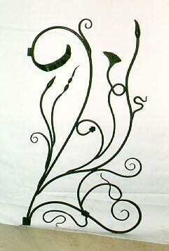
http://www.silkroadcarpetandrugs.com/views/images/collections/geometric/full/geometric12.gif http://www.artistblacksmith.com/gardengate.jpg
 Proportion -
1. The comparative measurements or size of different parts of an object or image.
2. The correct, attractive or ideal relationship in size or shape beetween one thing and another or beetween parts of a whole.
1. Allowing light to pass through so that objects behind can be distincly seen.
2. (In relation to grahic designing on a computer)When an object is not printed at its full opacity allowing imagery or text behind it to show through.
 Asymmetry -
1. Lack of equality or equivalence beetween parts or aspects of something.
2. Lack of symmetry.
3. Lopsidedness.
 Aesthetics -
1. A set of principles concerned with the nature and appreciation of beauty.
2. The branch of philosophy that deals with the principles of beauty and artistic taste.
3. A set of principles underlying and guiding the work of a particular artist or artistic movement (eg: the Cubist aesthetic).
 Emphasis -
1. Special importance, value or prominence given to something
2. Vigor or intensity of expression.
3. A difference in colour, size or placement of an element in a composition which tends to cause the element to be especially noticable.
Adjective List:

Organic-
1. Of relating to or derived from living matter.
2. Having the appearance of a naturally occuring or living thing.
3. A style of line or form in which the objects are shaped in such a way that they appear to be alive or natural, usually involving flowing curves and voluptuous rounded shapes.
 Geometric-
 1. Of or relating to geometry, or according to its methods
2. Characterised or decorated with regular lines or shapes
3. A style of design where most or all of the elements used are straight lines, circles, ellipses and regular polygons.
4. A modern style derived from the more ancient styles of Ad Triangulum (made of or following the lines of triangles - 0, 30, 60, 90, 120, 150, 180 degrees) and Ad Quadratum (made of or following the lines of squares - 0, 45, 90, 135, 180 degrees)

Monochromatic-
1. Containing or using only one colour
2. Of a single wavelength or frequency
3. Lacking in variety, monotonous
4. A style of colour use where the only colours employed in a piece are shades and tints of a single hue.

Matte-
1. Dull or flat, without a shine
2. Antonym of gloss
3. A sheet of cardboard placed on the back of a picture, either as a mount or to form a border around the picture
4. A quality of a substrate where the surface is textured on a very fine scale thus breaking up any reflection on the surface
 Nebulous-
 1. In the form of a cloud or haze
2. Unclear, vague or ill defined
Principles & Elements of Design List:
Elements:
 Line - Line is fundamental to design. A line is a mark made by the moving of a point, which can be made to have a psychological impact depending on its weight and direction and by variations in its weight and direction. There are a wide variety of types of line, including: agressive, straight and calm, dynamicly angled, chaotic, gently curvaceous, energetically curved, lyrical, textural, tonal, implied and psychic.
 Colour - Colour is the property of an object that refers to the way that it reflects different wavelengths of light, the range of colours represented by a rainbow make up the colour spectrum with red (long wavelength) at one end and violet (short wavelength) at the other. These colours can also be arranged into a circle making a colour wheel, which has the three primary colours; Red, Blue and Yellow spaced at 120degree angles to one another and with the secondary and tertiary colours in beetween. It is important to note that these primary colours apply only to pigments and there is even disagreement since many artists say that the primary's are Cyan, Magenta and Yellow, like those used in the printing process. None of these are the true primary's though since colour by its very nature is light, and the primary colours for lighty are Red, Blue, and Green. When mixing colour with light we call it additive colour and with pigments subtractive.
Different colours have different psychological effects on people and cujure up different emotions, for example: Blue - calm and relaxed, Red - exciting and lusty, Green - envy and sickness as well as natural and serene, Black - depressing and evil, White - pure and clean.
Different colour combinations are given different names depending on their relative position on the wheel: Complimentary is colours which are on opposite sides of the wheel, Analogous is colours that are near each other on the wheel, Monochromatic is variations in brightness of a single colour, Triadic means that the colours are at 120 degrees to each other on the wheel, the primary colours are an example of this.
Colours are also refered to as hues, and different brightnesses are referred to as values


 Texture - Texture refers to the surface quality of an object, it is a sensation of touch that can be invoked visually by the way line and shape are used. Some types of texture are: smooth, rough, ridged, spiky, grainy, undulating, cracked and embossed.
 Shape and Form - these are masses of colour or areas encompassed by lines which define objects in space. By their existance they imply the space around them. Space is the precondition of all that exists.
Shapes and forms can be two dimensional or three dimensional and can be organic or geometric in nature. Organic shapes are things such as the contours of a landscape, naturally occuring things like plants, or the curves of the human body. Geometric shapes are things like squares, circles, triangles, spheres and cubes.
 Principles:
stability and dynamics are most easily defined in relationship to the invisible grid implied by a page or space.
 Stability - this is where objects align themselves to the lines of the grid, stable layouts can be central or symetrical but are not neccesarily so. It tends to create a sence of rigidness or order.
 Dynamics - this is where the elements on a page are not aligned to the grid, often involving diagonals or seeming randomness. it can be used to create a sence of movement, energy or instability.
 Rhythm - in rhythmic layouts copies of an object or many similar objects are arranged with similar spacing or as if they are filling grid squares. As the name suggests this tends to create a sense of rhythm and so is often used in the music industry for album covers and so forth.
 Scale - when a design is either dominated by one very large shape or image (maximum object), or when a design has alot of space in it and the shape or object is very small (maximum space), we refer to the design style as using scale.
The use of large amounts of white space is very popular these days in areas like advertising because it seems to give the impression that other than the object pictured there is nothing else in the world.
Bibliography & Image Credits:
http://vinugaa.files.wordpress.com/2009/04/squiggly_buildings.jpg
http://www.canadianshakespeares.ca/multimedia/images/bnl_cd_cover.jpg
http://www.cddesign.com/covertalk/images/dark-side-of-the-moon-cd-cover-design.jpg
http://www.sonhenry.com/cd_art/live_cd_cover_2s.jpg
http://www.freedos.org/freedos/images/logos/cd-cover-2004-slogan.jpg
http://www.weborithm.com/wp-content/2009/07/transparent-jellyfish-689547-sw.jpg
http://photos.essence.com/system/images/gallery/000/015/672/full/hairstyle-asymmetric-bold-angle_src.jpg
http://farm2.static.flickr.com/1200/801482765_17a56d1b72_o.jpg
http://www.nhsdesigns.com/images/examples/graphic-principles_emphasis.jpg
http://www.silkroadcarpetandrugs.com/views/images/collections/geometric/full/geometric12.gif http://www.artistblacksmith.com/gardengate.jpg
http://clemag.com/IL308WhMatteRicePaper.jpg
Apple Computer Dictionary, version 1.0.2
Apple Computer Dictionary, version 1.0.2
Subscribe to:
Posts (Atom)